From Screens to Customer Experience: Five Principles for Better Customer-Facing Digital Signage

Ben Smith
An authority on digital transformation of physical spaces, Ben has 20+ years helping top-tier companies improve their customer and staff experience.
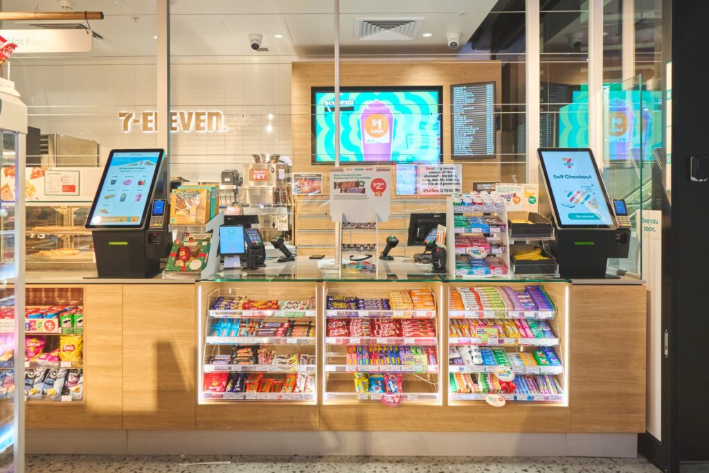
Whether customers are buying a coffee, filling a script, refuelling or opening an account, many of their most important decisions still happen in physical locations. Yet customers now judge those experiences against the speed, consistency and convenience they find online. Digital signage earns its place when it closes that gap: guiding customers, making information easier to access, reducing the frustration of waiting and strengthening brand perception. It should do more than simply fill the space.
More screens do not automatically create a better customer experience. Successful programs give every screen a clear role in the customer journey and make each message understandable at a glance. For multi-site brands, the real challenge is to deliver that experience consistently across every location, every day while keeping content relevant to each site, audience and moment.
Drawing on more than two decades of designing and delivering customer experiences across retail, pharmacy, banking and financial services, fuel and convenience, quick service restaurants and beyond, we have distilled what works into five guiding principles for better digital signage.
1. Purpose before pixels
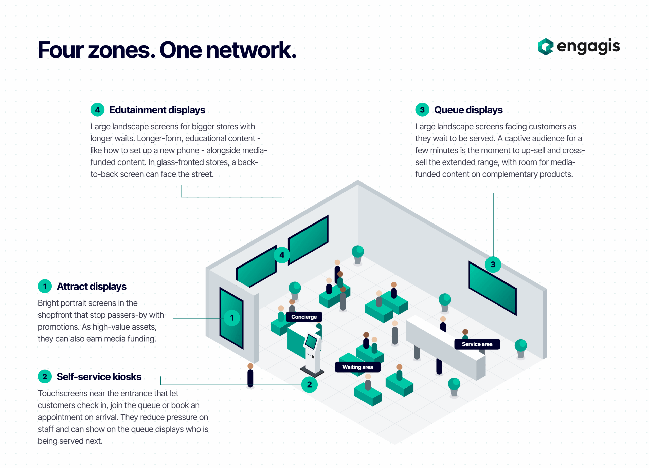
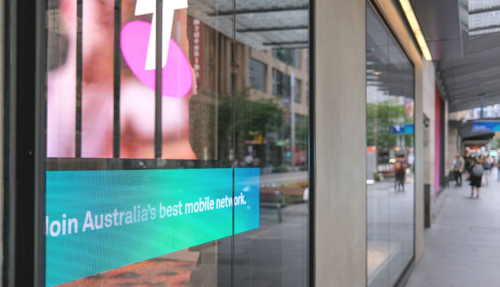
Each stage of the customer journey calls for content matched to the customer’s mindset at that moment. A screen facing the street might attract attention, while one near a queue can highlight relevant products or services. Screens in longer-wait environments can support more educational content.
Effective programs begin with the customer need rather than the hardware. Before creating content, define the screen’s role in the journey, who will see it and what action or response it should encourage.
Purpose also determines the right touchpoint:
- Digital signage informs, promotes and guides
- Self-service kiosks let customers order, check in or pay on their own terms
- Wayfinding displays and directories help people find what they need without assistance
- Electronic shelf labels keep pricing accurate at the shelf edge
Each touchpoint plays a distinct role, but together they should form one connected journey.
Format and category shape the brief as well:
- Fuel and convenience: fast decisions in a small footprint
- Pharmacy: health information balanced with privacy at the counter
- Quick service restaurants: order accuracy and menu boards that stay current across every site
- Banking and financial services: building trust while guiding customers to the right service
2. Placement is everything
Where a screen sits determines whether it is seen at all. Displays should be mounted within natural sightlines, at a height and angle that suit how customers approach them, and clear of columns, fixtures or competing signage that obscure the view. A screen that has to be searched for has already lost the moment.
The physical environment matters just as much. Typography and imagery must remain legible from the expected viewing distance, and brightness should be matched to ambient light, from sun-drenched shopfronts, forecourts and drive-thrus to dimly lit aisles and branch interiors. In bright or variable conditions, high-brightness or e-paper displays can maintain readability where standard screens would wash out.
3. Say less, land more
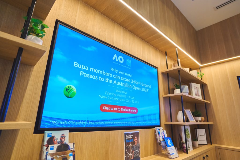
In busy retail environments, screens compete for fleeting attention, so effective signage must reward a quick scan. A clear visual hierarchy should reveal the most important information first, while whitespace keeps the message from feeling crowded. Short passages, bullet points and familiar icons reduce cognitive load. Colour can then reinforce brand consistency, set the appropriate tone and improve readability, provided there is sufficient contrast.
Every message should also have a clear purpose. Where a response is required, calls to action should be visible, specific and relevant to the setting. The experience should feel consistent with the brand’s other customer channels rather than operating as a disconnected campaign.
4. Design for the brain, tune for the moment
The order in which information appears shapes what customers retain. People are more likely to remember the first and last messages they encounter, making the opening and closing moments particularly valuable. Focusing each screen or content segment on one central idea reduces cognitive overload, while familiar visual cues (such as a dollar sign for price or a padlock for security) help viewers interpret information more quickly.
Motion should direct attention rather than compete for it. Used deliberately, animation guides the viewer toward the most important element and progressive reveals make complex information easier to follow. Each message also needs enough time to be read comfortably, with smooth transitions that keep the experience coherent.

Content should also reflect its context. A centrally governed network can still adapt to differences in location, site format and customer audience, as well as product range, active promotions and time of day. Supplier and brand-partner campaigns can be scheduled by site and zone, allowing the network to operate as a retail media channel rather than simply a cost line.
5. Choose a partner, not a price
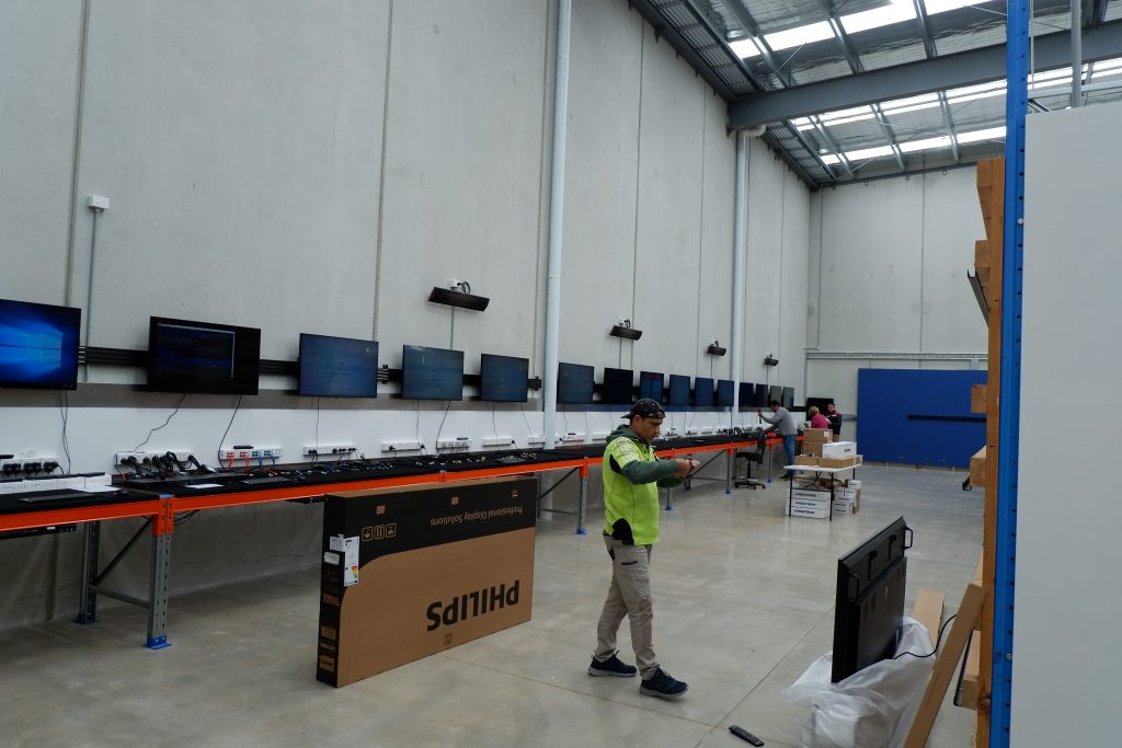
Choosing a technology partner is a long-term commitment and requires proper due diligence. The right partner starts with your spaces, operating conditions and requirements rather than a product catalogue. Hardware must suit the environment in which it will operate: commercial-grade displays for extended trading hours, e-paper for bright or low-power settings, and kiosks robust enough for constant public use. Equipment selected without those conditions in mind rarely performs as intended.
The content management system matters just as much. Choose a platform that meets today’s requirements and anticipates tomorrow’s, with:
- Central control and local flexibility
- User permissions and scheduling
- Reporting on what played and where
- Integration with the wider technology stack
Connecting screens with loyalty programs, click-and-collect, online catalogues or real-time stock visibility brings the convenience customers expect online into every physical location.
Above all, resist choosing on price alone. The cheapest option rarely stays the cheapest once support, downtime, workarounds and early replacement are factored in. So ask the harder question: what would dark screens across your network really cost you? Every blank display is a missed promotion, a lost sale and a visible crack in the brand experience. A platform and partner that can scale from one site to hundreds, and evolve as the network grows, will deliver far greater value over the life of the investment.
Better signage begins with better decisions
The most effective digital signage works as a coordinated customer communication channel shaped by clear purpose, smart placement, disciplined content and a technology partner built for the long term.
No single principle carries the load on its own. Compelling content is wasted on a poorly placed screen, the right placement means little if the message fails to land, and none of it matters if the network goes dark. The brands that get it right treat strategy, environment, content and technology as one connected decision, not four separate ones.
For any brand with a physical presence, the opportunity is to stop asking, “What should we put on the screen?” and start asking, “What does the customer need at this moment?” That question changes the decisions that follow; where a screen belongs, what it should communicate, how its content should adapt and which technology can deliver reliably at scale. The result is signage that is more useful to customers, more relevant to each location and more commercially valuable long after launch.
If you’re not sure every screen in your network is earning its place, talk to the Engagis team. We’ll help you work out what each one should be doing for your customers.
You Might Be Interested In
Retail Media vs Commerce Media: What’s the Difference?
Digital Signage Solutions: A Complete Guide
Cloud-Based Digital Signage: Security, Uptime and Governance for Enterprise Networks
Your Digital Signage & AV Starts Here
Get expert guidance, reliable delivery, and ongoing support - end to end. Talk to our team about solutions tailored to your organisation.